Aotea Energy
Aotea Energy’s brand design bridges tech startup with real hardware enginnering. The brand identity balances its technical architectural appeals with a clean simple forward-looking aesthetic
Designing for a clean-tech hardware startup demands a balance between technical credibility and approachable consumer utility. Aotea Energy needed a identity that felt inherently natural and clean while holding its own alongside global tech startups and smart-home brands.
Grounded geometry & dynamic flow
The core identity relies on a precise typographic system paired with a minimalist geometric mark. The mark reflects energy storage and seamless distribution - geometric forms echoing hardware precision combined with smooth curves that signify current and movement.
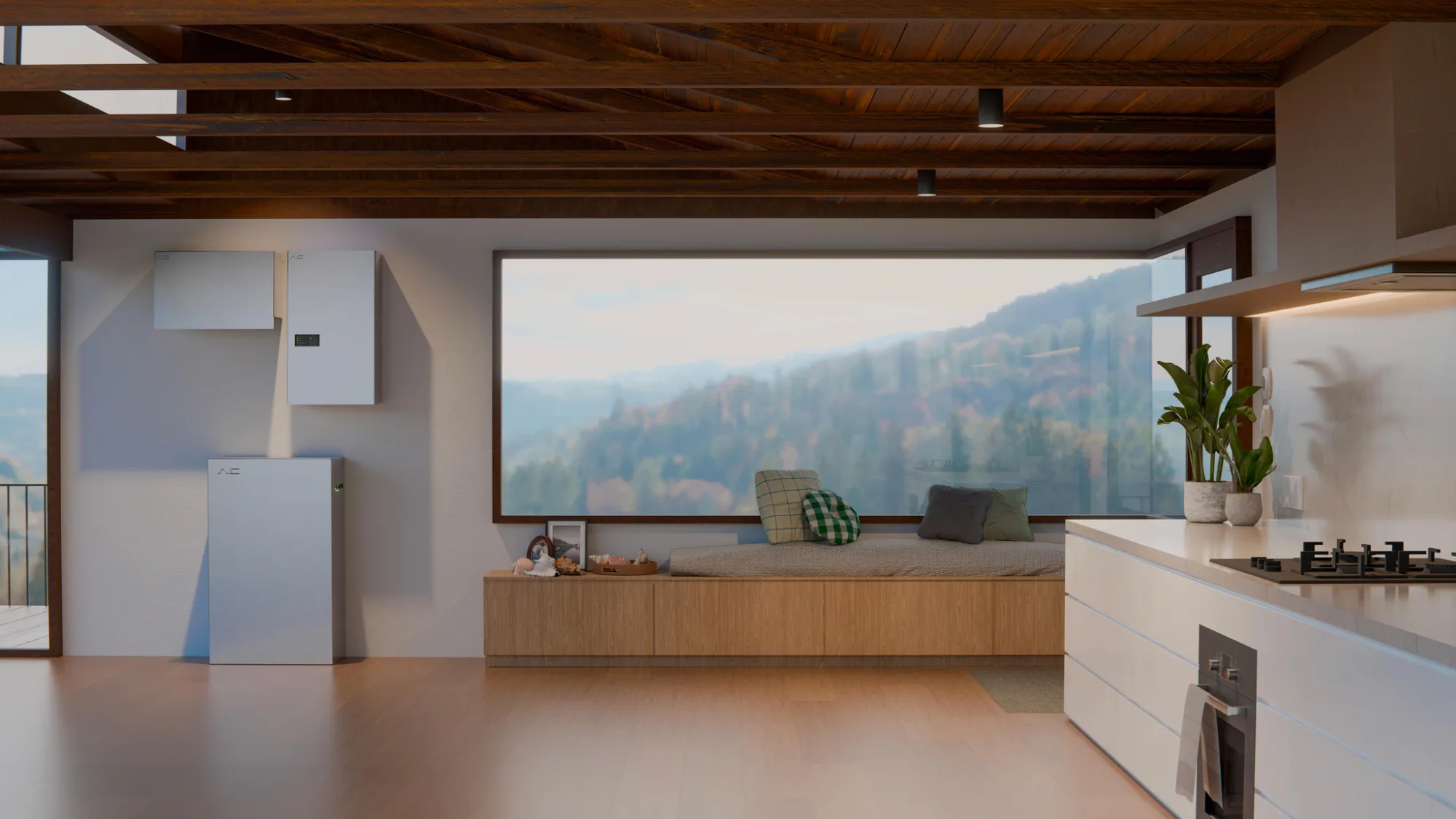
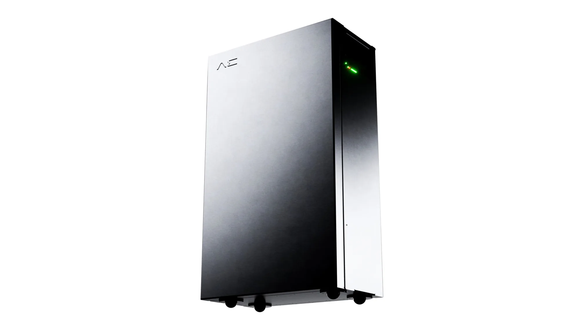
Colour selection moves away from soft eco-greens, leaning instead into ultra-clean monochromatic base tones accented by high-visibility energy accents. This gives the physical hardware (like the AE-1 unit) a premium architectural finish while ensuring high-contrast clarity across digital dashboards and mobile software interfaces.
Application & hardware integration
The logo system was developed to work at micro-scale (laser-etched onto hardware casing and anodized aluminum panels) and macro-scale (digital app interfaces and fleet graphics). Typesetting relies on a technical geometric sans-serif, engineered for extreme legibility across dynamic telemetry charts and physical safety labeling.